Thursday 19 December 2013

Representation of men/women in my chosen genre: Pop

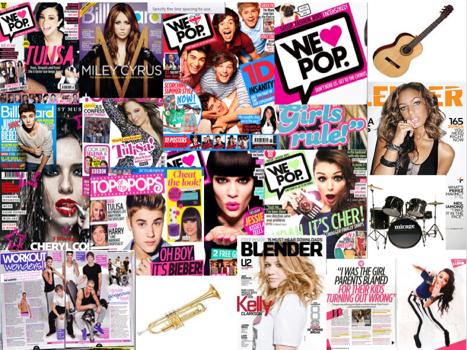
Women are presented as attractive and sophisticated on front covers of pop magazines. This is because young people look up to artists/bands who are 'hot' and want to be like them, so by having a young hot artist on the front makes the reader want to buy this magazine. Also by having women looking attractive attracts male attention as men cant resist a hot body on the front of the magazine.

Women mostly wear revealing clothing or pretty dresses, this also makes females look up to them as they desire for the 'perfect body' or want to be trendy like a famous artist. For example; Beyonce is wearing a metal dress with skin showing to show off her figure. Her hair is big and crinkled and she is smiling with her white teeth. This attracts male and female attention as they see a stunning artist on the front cover. 


Men are presented as hot and good looking on front covers of pop magazines. This is to attract young girls, as they are have crushes on their favourite artist. Men are shown to be smiley as they want to show their soft gentle side.They also usually have their body showing or wear a t-shirt to show of their abs. This makes young teens excited to read the magazine.

Men artists enjoy being the centre of the magazine as they like to present themselves as being an alpha-male figure. This represents them as being 'perfect' however can also sometimes be seen to be big headed but they have to be to get their fans attention.
Mind Map of ideas on my chosen genre: Pop


Mood board of pictures


I have created a mood board which includes of double page spread articles, front covers and musical instruments that are associated with pop artists. on the genre pop as I have decided to create my own magazine using the genre pop. Creating this mood board has helped me with my planning as it has given me ideas on names of titles and designs for the layout.  Looking at the double page spread articles most of them include a main image of an artist looking at the camera to engage the audience. The use of bright colours: pinks,  blues, yellows, greens, oranges and purples have also gave me a clearer idea of what colours to use on my own magazine. 

Wednesday 18 December 2013

Group work lesson- Double page spreads

Working in a group, we analysed three different music magazine double page spreads. This helped me to understand what to include in my own double page spread and I learnt from other peoples ideas so that we can all help each other in our research and planning.


 Music magazines in a shop


I went into my local shop and had a look at what music magazines they had and how they were positioned. They had Rock  magazines positioned together - Kerrang, NME and Rock. And  there were also pop magazines e.g- 'Mizz' together. This showed that pop and rock were the most listened genres in the area as there werent any other genre of magazines in the shop. I am going to analyse each magazine that I saw in the shop individually and suggest the ideas that I got from them for my own magazine.


The 'Classic Rock' magazine stood out from the other magazines as the name is big and bold going across the top of the page. Also the magazine includes a free calendar and a 'best of the year CD' which will help get a larger audience to buy this magazine as it will include their favourite songs. The headline 'Best of 2013' also stands out as it is in yellow and is clear against the dark background. In my own magazine, I will include a big headline and include a main image of the artist.


The 'Kerrang' magazine is a rock magazine. This magazine I had done some research on as I knew this magazine is targeted at 16-24 year olds. Also I knew that the genre of the magazine is rock as I know that the colours usually associated with this magazine are red, yellow and white. The main thing that noticed my eye when I saw this magazine on the shelve was the images of the band pulling faces with their santa hats on. Also the headline 'The Christmas issue' helps makes more sales as its a busy time of the year and knowing its a christmas issue will include festive things and new singles released. 


The 'NME' magazine is also another music magazine I was familiar with as I have researched this magazine as it's a popular rock magazine. The 'NME' logo stands out from the rest of the writing as its a popular magazine. The writing is in christmas colours which makes the magazine look festive and fun.  I like the use of drawing a hat on top of the artists head to make it look more creative and funky rather than having a real hat on his head. I may decide to do this in my own magazine. 


Another music magazine that was shown on the shelve was a pop magazine 'Mizz'. This magazine I had never seen before, but it caught my eye straight away with the bright pink bubble with 'POP!' written in big bold writing in the corner of the magazine. The magazine also has the band One Direction on the front cover which will attract to the teenagers as they are the UK's favourite boy band. The Wanted are also shown in a smaller image on the front cover, as young girls think they are 'hot'. I like the idea of using smaller images of celebrities on the front cover to give an insight of the magazine. Also as I am thinking of doing 'POP' as my genre, the use of a funky font like the one on this magazine is a good idea as I want my magazine to stand out from other POP magazines that are available at the moment.


Audience research

Pop and Rock


Q magazine covers the genre of pop and rock. 

An audience of pop would be around 12-24 year olds. People who read this genre would be mostly females but also males. 

The audience of rock would be older males, and indie would target a younger audience who are aged around late teens and younger adults.

The majority of Q’s readers are male. The statistics also show that 83.8% of the readers are 15-44 years of age. This shows Q’s ability to make the magazine appeal to a wide range of ages and social groups. Q does this by featuring currently popular artists like Adele and classic artists like Madonna and John Lennon, they even feature artists that are  deceased as some issues are dedicated to them. E.g- Amy Winehouse had an issue dedicated to her after her death in 2011.


Pop and Reggae


The genre of Billboard magazine covers pop and reggae.


The target audience for Billboard magazine varies from young teens, from the age of 16, to young adults, at the age of 26. This is because the magazine provides its readers with the latest updates from the charts, but of different and various types of genres.

This is to widen the range of the target audience as its acquired to people who listen to different genres such as; rock,metal,pop, R n B and plenty more.

The layout of the magazine is very mature as its not over-crowded with images of teen bands and other artists. It does not advertise news and gossip of the artists lives, but only conveys the weekly update of the music charts.


Country

The genre country music is targeted at 18-54 year olds with a main audience of 25-45 year old adults. 

40% of country music listeners are in the top demographic and about 38% of the American population are country fans. In the more recent years, country music has gained a lower target audience due to artists such as Taylor Swift who also features in pop and is played on the mainstream music radio stations.

Country music magazines are aimed at a broad audience, both male and female. I think this because the colours are brown and masculine but the main image could be attractive to a female audience, especially as they are "good looking".

Country music is part of a cultural make up. In america children are brought into the likes of country because of their surrondings. Especially in Western America, People like Jonny Cash are played and become part of the culture.

Classical

The main audience of classical music is males and females ranging between 50-70. The audience is very specific as the amount of people who listen to the genre is decreasing regularly.

The magazine uses a celebrity Myleene Klass on the front cover which also relates to the genre 'Classical' , as Myleene Klass is a classy sophisticated woman which could mean the magazine itself is targeted to older adults who may enjoy the piano and flute.

The layout on most classical magazines consist of whites,reds and blacks. Classical magazines use these to attract to both male and femalles equally and to match the genre of music.

Tuesday 10 December 2013

Research into different institutions

Bauer Media Group was founded in 1875. It is a multinational media company headquartered in Hamburg, Germany which operates in 16 countries worldwide. It used to be called 'Heinrich Bauer Verlag KG' which was abbreviated to 'HBV' and sometimes shortened to 'H.Bauer'.

Bauer has been managed by four generations of the Bauer family. It started in a small printing house but now it is grown into a worldwide publishing and media company.The Bauer Publishing Group comprises 300 magazines worldwide in 15 countries as well as televisions and radio stations.

Bauer started publishing magazines in the UK with the 'Bella' magazine in 1987 and soon became Britain's third largest publisher. Bauer  further expanded in the UK with the purchase of Emap Consumer Media and Emap Radio in 2008 and then they became the UK's biggest publishing group. Bauer's subsidaries is Bauer Radio and Box Television. Although Box is also owned by Channel 4.


SpinMedia is a company and blog network based in Los Angeles. It owns a community of pop culture websites including Buzznet, Idolator, and Stereogum.

Buzz Media was founded by Anthony Batt, Marc Brown, Kevin Woolery, and Steve Haldane under the name Buzznet. Batt and Brown started a blog in 1999, and by 2006 Buzznet had a total of nine people in the Los Angeles, California area. The Buzz media name was created as the company started to acquire more pop-culture and music blogs.

 After the print version of the magazine finished, it rebranded itself as Spin Media in March 2013. At that time, Steve Hansen became its chief executive. In April 2013 it acquired Vibe magazine.


New Musical Express, created by Theodore Ingham, is a UK weekly pop/rock music magazine, published since March 1952. It started as a music newspaper, and then moved towards a magazine format during the 1980s and 90s, changing from newsprint in 1998.

It was the first British paper to include a singles chart, in the 14 November 1952 edition. In the 1970s it became the best-selling British music newspaper. During 1972 to 1976, it was associated with gonzo journalism then became closely associated with punk rock through the writing of Tony Parsons.

The cover on NME always features a famous artist. Aritists such as Kasabian, Lily Allen, The Prodigy and The Kings of Leon have recently featured. NME also holds its won award show, the NME awards sponsored by ShockWaves hair gel. There is also an NME music channel and an NME radio station. The magazine also has a website to view information and the magazine online.


Monday 9 December 2013

Analysis of double page spread of magazines

This double page spread is from an NME magazine which is focused on Florence + The Machine.

They have used a  picture of Florence Welch which takes up  the entire left page and the information regarding the article and the text is all on the right page. 

The title 'USA' takes up both pages. This shows what the article is partially about with Florence sitting on a box with the American flag.  It also has a lyric from her song 'got the love' this could mean USA's got the love. Underneath the main title there is a subtitle, this explains more about the article but is still quite open and ends with a question making the reader want to read the article. 

Florence is wearing a black tight outfit and high black heels, which gives off a sophisticated look and she is positioned which her leg up and her hand gently resting on her leg, which shows she is posing and is confident with herself. Her hair is also red which matches the colour of the flag and also connotes 'love'. Her facial expression is quite serious which connotes the subtitle '2009's biggest success story'. 

The text is simple and is in black which is consistent throughout and matches her outfit. 
The artists name 'Florence Welch' is presented in blue writing to stand out as the article is focused on her. 


This double page spread is from Q magazine which is focused on Lana Del Ray. 

They have used a low key lighting but her face is shown with the light focusing on her. Her eyes are closed and she is wearing dark eyeshadow which could define the article. Her face is pale and her dark makeup makes her look bruised. The image is a close up shot defining her lips and eyes which relates to the article as it describes what her first impression was in front of the camera for the photo shoot, letting the reader know how the artist acts and on her appearance.

The text used is simple and is in black which is professional and is clear to the reader. Lana Del Ray's name is titled above the article to show its focused on her. Inside the text there is a short sentence used through the description - 'exposed'. This word suggests that the article will be open, letting the audience in on all Lana's secrets.


The article uses formal language and includes some complicated words which could be targeted to an older audience, around 25 years old. The fact that the target audience is slightly older means that the magazine can afford to be a bit more expensive than if it was aimed at young people as the majority of these people have paid jobs. 


This double page spread is from Top of the Pops magazine which is focused on Jesse J.

They have used a photograph of Jessie J posing and smiling which shows she is a woman who does not care about other’s opinions on her and is proud of who she is. There is also another smaller image of her  sitting with three other judges on the singing contest, ‘The Voice UK’, where she looks serious and focused. This suggests to the reader that Jessie J has her happy moments, as well as her serious/focused moments, making her appear to be normal towards the reader. 


The background is spotty which matches Jesse J's top.  The overall article’s layout is feminine, as it sticks to bright colours and uses stylized fonts to appeal to its readers. They have highlighted the questions in a bold purple to make them clear to the audience and to show that she was asked these questions from the audience. 

There is a quote on the page that states ‘I’m shaving my head for charity’; helping the reader as it picks out the most important quote of the whole article, linking back to the title of the page as the featured artist is aware that people ‘judge’ her for her actions on a regular basis, it also allows the audience to see Jessie J in a different light and perhaps change their opinions of her as an artist.
  

The language used in the article is basic, this helps to appeal to its young audience as it makes it manageable for the reader to understand what the featured artist is saying. Jessie J says “I’m not there to judge anyone...” keeping it simple for the reader. Jessie also uses the word ‘cool’, a word that is familiar within the target audience, helping her to establish a connection between her and the audience.

Thursday 5 December 2013

Analysis of contents pages

The content page for Top of the Pops has a clear layout with subheadings which include the page numbers of what is included in the section.

The content page uses a consistant colour scheme throughout. They have used white writing  for the subheadlines highlighted in bright purple. The page numbers are also written in purple. The background of the content page is white which looks professional and clear.

The images used help to excite the demographic audience as they have used a picture of one of the band members from the wanted topless. This will encourage young giggly girls want to read on! They have also included an image of JLS' new calender which all the girls will love because they are a popular band.

The sub-headings are catchy and get the point across. 'Celebs & Gossip' helps increase sales as most young teenagers want to read about the singers gossip and find out whos going out with who. The sub-heading 'We shopping' is also catchy and most girly girls love to shop so if a young girl picks this magazine and buys it she will be able to read about the new trends available.

They have used a funky explosion bubble that says they have highlighted everywhere where you can find gossip out about fit lads. This is good because it will increase sales as many of the 'fit' lads are celebrities and young girls look up to them as their idols, also by having each section highlighted gives girls info on all they need to know about boys.

The staff writer has also written a comment to persuade young people to buy this magazine. 'We've got 11 buff beach boys in the issue' . The use of the word buff relates to young girls as its another word for 'fit' , this addresses the audience. They have also included images of the writer hanging out with singers, e.g- olly murs. This shows the teenagers that she has actually spent time with them and can tell some gossip about what they have been up to!


The content page for Vibe is funky and has its own unique layout. The title 'Contents' is split up underneath eachother, this creates a stylish effect. This may be because it is targeted at a younger audience. The masthead is also written in white which is in contrast with the black background, this is effective as it grabs the audiences attention.

There is an outline of a 'v' in the background which reminds us the name of the magazine 'vibe'. The use of just the 'v' creates an edgy effect rather than writing the whole word out. This links with the models legs being shaped in a 'v'. The model is lying on the floor with her legs up, this gives off a promiscuous feel and she is looking at the readers to address them. Her body language is also confident and relaxed, this shows that she knows she is good looking and wants to show off her body and maybe might inspire women to be happy with themselves, so therefore they would read more about her.

In the text there are a lot of words that have been highlighted in bold, this may because they are keywords and the reader can read them and have an idea of what the article is about.

The contents lists are split into two sections. This makes readers less confused. Also some people may only want to read information on features or fashion so this layout gives a clear direction on what to read.

The model is wearing silver and gold this could suggest that she is wealthy and classy. This could relate to the magazine itself being classy by the model reflecting this. The lighting in the main image is high key and looks like she is glowing as further back its black. This could symbolise that the model or magazine is innocent by having an angel glow but can also be quite devious aswell.


The content page for Blender is very original and is laid out simply with the features on the right hand side of the page and a image in the centre towards the left of the page is an image of a female singer which takes up most of the page.

The colour scheme used is very girly, with the outfit and expression matching this look. They have used a bright pink for the sub-heading 'Features' and   have used a black font for the rest of the writing which is consistent and gives off a professional look. They have only used a few colours on the page such as, pale grey, black and red which go together well. By using little amount of colour adds simplisity and doesn't over power the page. Also by using a light colour in the background automatically draws the auadiences eye to the foreground of the image and to the features, which are the main and most important things on the page.

The contents title is huge and fits right across the top in a sort of retro style font. There are four headlines, but only the main stories have been included on this page. All of the stories are just the names of the artist and underneath is a small blurb. Beside the image is a quote from Katy Perry, which is unusual for a contents page, but gives the reader an insight into the story.

The model is wearing a girly outfit which anchor the theme of playfulness. This also links with the prop of the balloon which also connotes playfulness. I would say that the target audience of this magazine is mostly men because the outfit she's wearing is more appealing to young men. However it could also be aimed at young girls who are quite confident with themselves because most of the pictures from other blender magazines are really provocative.

In my own music magazine I might include a quote from a celebrity which gives the reader a bit more of an idea into the story. I would also include gossip and news as this gives the reader an excitement to read on. I will use a consistant colour scheme also, to make the magazine look professional. 

Tuesday 3 December 2013

                   History of a music magazine


From my research of Top of The Pops I have learnt that not much has changed since when the magazine first started running in February 1995. The magazine began much like the Q magazine, then changed its editorial policy to directly compete with popular teen celebrity magazines such as Smash Hits and Big.

Top of the pops format has gradually changed, with less music content and is now targeted to young girls. The magazine is still in publication even though the TV show was canceled. The magazine has always stuck to having a main popstar/group on the front cover that was popular in the charts at the time. The magazine is the UK’s biggest-selling teen title.

The major change of the magazine is the title. The name of the magazine has gradually changed throughout the years. It started in big bold writing then went to a style that is funky and brand new. The 'S' on the title is curly which shows the girly side of the magazine. The title has had several editors over the years, including Peter Lorraine, Corinna Schaffer and Rosalie Snaith, and contributing editors including Adam Tanswell. Its current editor is Peter Hart.

The use of bright colours has remained throughout the years. This gives the magazine a lively eye-catching look. Each magazine has a catchy headline to adress the audience.

 It is aimed at younger teenage girls from the age of 11-15. 85% Girls and 15% Boys read this magazine. The main focus of the magazine is pop music. It provides celebrity gossip about the featured artists in the magazine, fashion tips, boys and beauty advice, quizzes, song lyrics and posters.

You can now buy the Top of the magazine online whereas you used to have to buy it in a shop. This has allowed the magazine to get far more buyers than before.

In my magazine I would use the technique of using different feature stories around the main image. I would also use different shapes on the cover e.g- stars and hearts to make it targeted to girls. I will also pick out some of the hottest bargains, where you can buy them, and include their price.